
|
One often needs to check the assumption that a population is normally distributed. A simple method for doing this, given some sample from the population in question, involves removing any outliers present in the sample, checking to ensure the remaining data is not skewed, and finally visually inspecting a histogram for the sample to ensure it looks roughly bell-shaped. However, with technology we can do much better...
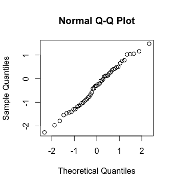
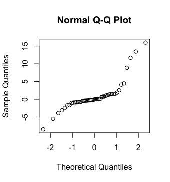
A QQ-plot is a graphical method for comparing two probability distributions by plotting their quantiles against each other. Supposing that one wishes to compare the distribution of $n$ values from a sample against a normal distribution, one first finds a set of cut-off values for the desired quantiles, and then plots these cutoff values against the sorted sample values. As one standard, the cut-off values correspond to those values with the areas under the normal curve and to their left that are shown below.
$$\frac{1}{2n}, \, \frac{3}{2n}, \, \frac{5}{2n}, \, \ldots, \, \frac{2n-1}{2n}$$If the resulting points roughly follow a linear path, the sample is distributed in a manner approximate to a normal distribution.
The following shows two qq-plots where the distribution of sample data is compared with the normal distribution. The sample associated with the plot on the left is approximately normal, while the one associated with the plot on the right is not.
 |
 |
In R, and supposing a vector $v$ corresponds to a sample of numerical data, one can easily produce the related QQ-plot to check the assumption that the data came from a normal population with:
> qqnorm(v)