|
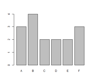
Bar plots are useful for displaying the frequency distribution of a given categorical variable.
For example, suppose one had a spinner that could result in the following (categorical) outcomes: A, B, C, D, E, or F. Recording 16 spins in a vector called spins, we first create a table of frequencies for the spins seen. Then, we pass this table to the barplot() function to produce the graphic we seek.
spins = c("A","B","E","D","B","B","C","F","B","D","C","A","F","F","A","E")
spins.freq = table(spins)
barplot(spins.freq)
Of course, if one already has the heights of each bar stored in a variable, things get even easier. Consider the following way to create a probability histogram for the hypergeometric probabilities of drawing $x$ red balls from a bag of $50$ red balls and $30$ blue balls if one draws $20$ balls from the bag.
x = 0:20
probs = dhyper(x,50,30,20)
barplot(names.arg=x,height=probs,space=0)
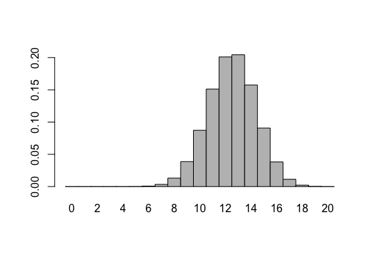
Note the names.arg argument is a vector that specifies the bar labels, height is a vector of bar heights, and space is a value that indicates the space to be drawn between the bars. Of course, in a histogram, this should be zero.
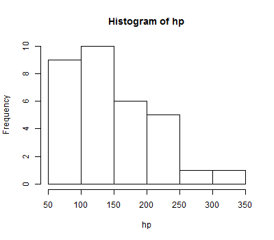
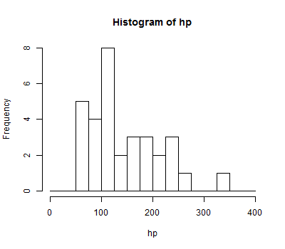
To visualize the distribution of a sample related to a continuous numeric variable, a frequency histogram is more appropriate.
Suppose one takes a sample of 32 cars, measuring their horsepower. The results are recorded in a vector named hp. We can quickly make a histogram using the hist() function:
hp = c(110, 110,  93, 110, 175, 105, 245,  62,  95,
       123, 123, 180, 180, 180, 205, 215, 230,  66,
        52,  65,  97, 150, 150, 245, 175,  66,  91,
       113, 264, 175, 335, 109)

hist(hp)
In the graphic above, R did its best to establish where the breaks between the "bins" should occur. One can specify these breaks explicitly, if desired, by using the breaks= parameter. Recall that seq(from=0,to=400,by=25) produces the vector that starts at 0, ends at 400, with every element 25 more than the previous one -- and then consider the example below.
hist(hp, breaks=seq(from=0,to=400,by=25))
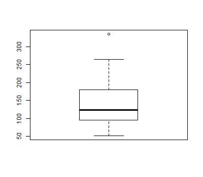
Box plots provide a convenient graphical representation of certain important statistics (i.e., min, Q1, median, Q3, max) as well as outliers, if they are present, that can be used to get a quick feel for the nature of a distribution at a glance.
Assuming again that we have horsepower measurements for 32 cars to be stored in a vector hp, we can produce a box plot for this sample in the following way:
hp = c(110, 110,  93, 110, 175, 105, 245,  62,  95,
       123, 123, 180, 180, 180, 205, 215, 230,  66,
        52,  65,  97, 150, 150, 245, 175,  66,  91,
       113, 264, 175, 335, 109)

boxplot(hp)
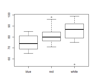
Box plots are particularly useful to compare multiple distributions quickly. Suppose you have saved data relating advertisement ratings to the color used in the advertisement to a file named advertisements.txt in your working directory (type getwd() at an R prompt to see what your working directory is). If you wanted to see how the distributions of ratings for red, white, and blue ads compared, you could graph box plots for each, side by side:
advertisements = read.table(file="advertisements.txt", header=TRUE)
boxplot(advertisements$rating ~ advertisements$color)
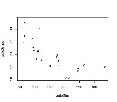
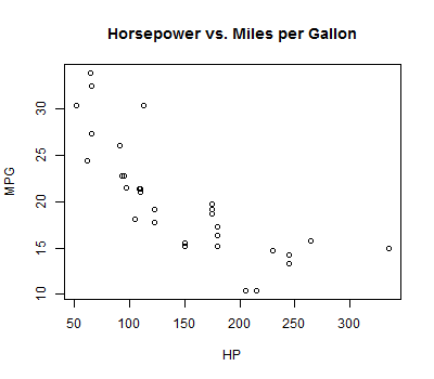
Scatter plots help one see the nature of the correlation between two numerical variables.
Suppose you have saved data relating horsepower to miles per gallon for 32 models of car to a file named auto.txt in your working directory. To see a scatterplot of horsepower (hp) versus miles per gallon (mpg):
auto = read.table(file="auto.txt", header=TRUE)
plot(auto$hp,auto$mpg)
You can customize many features of your graphs through the use of graphic options.
One way to specify these options is through the par() function. If you use this function to set parameter values, the changes you make will be in effect for the rest of the session or until you change them again.
The following gives an example of using the par() function:
# Setting graphical parameters using par()

par()                      # view current settings

orig_par = par()           # make a copy of the current parameters for restoration later

par(col.lab="red", lty=2)  # set parameters to:
                           # make x and y labels red,
                           # draw dashed lines (type 2 lines)

hist(mtcars$mpg)           # create a plot with these new parameters

par(orig_par)              # restore the original parameters
The second way to specify graphical parameters, as shown below, is by providing them inside certain plotting functions (e.g., plot(), hist(), boxplot, etc). In this case, the options are only in effect for that specific graph.
# Setting graphical parameters within the plotting function

hist(mtcars$mpg, col.lab="red", lty=2)
One can set the following parameters to change the title or axis labels for a graph.
| option | description |
|---|---|
main | the main title of a graph |
xlab | the $x$-axis label |
ylab | the $y$-axis label |
As an example of using these options, consider the following modification to our earlier scatter plot:
plot(auto$hp,auto$mpg,main="Horsepower vs. Miles per Gallon", xlab="HP", ylab="MPG")
The following options can be used to control text and symbol size in graphs.
| option | description |
|---|---|
cex |
number indicating the amount by which plotting text and symbols should be scaled relative to the default. 1 = default, 1.5 is 50% larger, 0.5 is 50% smaller, etc |
cex.axis | magnification of axis annotation relative to cex |
cex.lab | magnification of $x$ and $y$ labels relative to cex |
cex.main | magnification of titles relative to cex |
cex.sub | magnification of subtitles relative to cex |
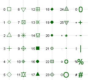
When plotting points, one can specify the symbol to be used for each point by using the pch= (stands for "point character") parameter. The possible values of this parameter and the corresponding symbols are shown in the table below. Note that for symbols 21 through 25, you can specify the border color (col=) and fill color(bg=).
One can specify whether lines should be drawn between consecutive data points and whether or not to mark the positions of the individual points with a symbol, as well. This is done through the type= parameter. The following values can be used:
| value | effect |
|---|---|
p | only the data points themselves are drawn (default) |
l | only line segments connecting consecutive data points are drawn |
b | both the aforementioned points and lines are drawn |
o | "overplotting" - this also draws both points and lines, but eliminates the gaps between them that are visible when b is used |
n | "none" - this creates an empty plot, where no points or lines are plotted. This can be useful as a starting point for constructing a complicated plot in many steps. |
After a suitable plot command (i.e., plot(), hist(), barplot(), etc), one can add additional points to be plotted, lines to be drawn, or other graphic elements (e.g., arrows, text, polygons, legends, even mathematical expressions) on top of the existing graph. If desired, one can often specify additional options just for these elements (e.g., col=, lty=, and others). The possibility of having these additional options is indicated by the presence of "..." in the functions listed below.
| function | result |
|---|---|
points(x,y,...) | Adds additional points to the current plot. The coordinates of these points are taken from the x and y vectors provided. |
lines(x,y,...) | Adds lines connecting consecutive points whose coordinates are specified by the x and y vectors supplied. Adding a type= parameter value can show a symbol at each point, if desired. |
abline(h=?,...)abline(v=?,...) | Adds a line that spans the plot either horizontally (h=) or vertically (v=) |
arrows(x0=?,y0=?,x1=?,y1=?,...) | Draws an arrow from $(x_0,y_0)$ to $(x_1,y_1)$. |
text(x=?,y=?,labels="?",...) | Adds the text specified by labels to the plot, so that it is centered at $(x,y)$. |
polygon(x,y,...) | Adds a polygon to the graph, where the vectors x and y specify the vertices of the polygon. |
legend(...) | Adds a legend to the graph. See the example near the bottom of this page or type ?legend() at an R prompt for more information on how to use this important function. |
When plotting lines, you can specify the type of line that is drawn (dotted, dashed, etc) by using the lty= (stands for "line type") and the line's width/thickness with the lwd= (stands for "line width") parameter.
The possible values that can follow lty= and the corresponding line types are shown in the chart below
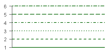
As for the value that follows lwd=, this value is simply the multiple of the default line width you wish to see. So for example, lwd=2 would create a line twice as wide as the default line.
Options that specify colors include
| Option | Description |
|---|---|
col | Default plotting color. Some functions (e.g. lines) accept a vector of values that are recycled. |
col.axis | color for axis annotation |
col.lab | color for $x$ and $y$ labels |
col.main | color for titles |
col.sub | color for subtitles |
fg | plot foreground color (axes, boxes - also sets col= to same) |
bg | plot background color |
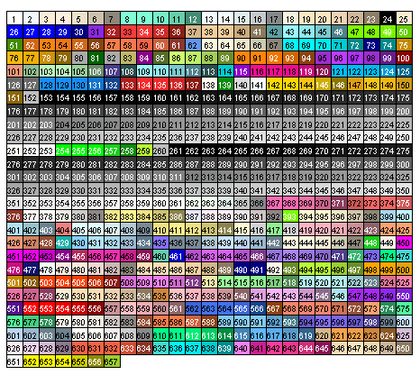
You can specify colors in R by index, name, hexadecimal value, or RGB values. For example col=1,col="white", and col=#FFFFFF" are all equivalent. The following chart gives some frequently used colors by their index:
The following code and the graphics they produce provide some concrete examples of using the functions and options discussed above.
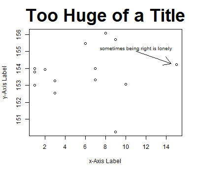
x = c(1,7,3,2,8,9,6,9,3,10,1,1,7,15)

y = c(153.01,153.99,153.26,153.95,156.1,155.7,155.47,150.25,152.54,
      153.06,153.99,153.8,153.34,154.22)

plot(x,y,
     main="Too Huge of a Title",
     cex.main=3,
     xlab="x-Axis Label",
     ylab="y-Axis Label")

arrows(11,155,14.5,154.3)

text(11,155.2,"sometimes being right is lonely",cex=0.8)
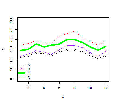
x = 1:12
y = NULL   # Note, using NULL here creates variable y without giving it a
           # value which is useful as we need to supply something to the
           # plot() function below, but the 'type="n"' means the y
           # that appears there won't actually be used.

y1 = c(112, 118, 132, 129, 121, 135, 148, 148, 136, 119, 104, 118)
y2 = c(115, 126, 141, 135, 125, 149, 170, 170, 158, 133, 114, 140)
y3 = c(145, 150, 178, 163, 172, 178, 199, 199, 184, 162, 146, 166)
y4 = c(171, 180, 193, 181, 183, 218, 230, 242, 209, 191, 172, 194)

plot(x,y,type="n",ylim=c(0,300),xlab="x")  # create an empty plot

lines(x,y1,type="b",pch=1,col="black")     # add data points
lines(x,y2,type="o",pch=4,col="purple")
lines(x,y3,lwd=5,col="green")
lines(x,y4,lty=2,col="red")

legend("bottomleft",                       # add a legend
       legend=c("A","B","C","D"),
       pch=c(1,4,NA,NA),
       lty=c(1,1,1,2),
       col=c("black","purple","green","red"),
       lwd=c(1,1,5,1))
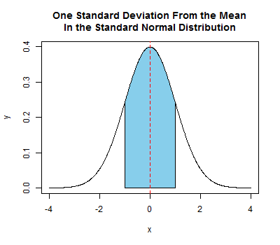
x = seq(from=-4,to=4,by=0.01)
y = dnorm(x)   # dnorm(x) is the probability density function for
               # the standard normal distribution

plot(x,y,      # draw the standard normal curve by connecting many very close points
     type="l",
     main="One Standard Deviation From the Mean\nIn the Standard Normal Distribution")

     # Note in the above specification of a title, the "\n" is how you indicate
     # you want a line break at that position

shadedX = c(-1,seq(from=-1,to=1,by=0.01),1)
shadedY = c(0,dnorm(seq(from=-1,to=1,by=0.01)),0)

polygon(shadedX,shadedY,col="skyblue")  # create the blue shaded area
                                        # from -1 to 1 on the x-axis.
                                        # here again, it looks curved, but
                                        # that's an illusion created by
                                        # a polygon that has many, many points
                                        # very close together across the top
                                        # (i.e., points that are 0.01 apart
                                        # in terms of their x coordinates)

abline(v=0,lty=2,col="red")   # draw the red dashed line specifying the mean
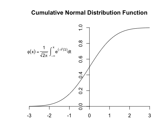
Here's one more example showing an annotation of a plot with a mathematical expression. For more information on how to do this, execute ?frac in R.
xs = seq(from=-3,to=3,length.out=1000)
ys = pnorm(xs)
plot(x=c(),y=c(),axes=FALSE,
     xlim=c(-3,3),ylim=c(0,1),
     main="Cumulative Normal Distribution Function",
     xlab="",ylab="")
axis(1,pos=0)
axis(2,pos=0)
lines(xs,ys)
text(-2, 0.7, expression(phi(x) == paste(frac(1, sqrt(2 * pi)),
                " ", integral(e^(-t^2/2) * dt, -infinity, x))), cex = 0.9)